ShopDreamUp AI ArtDreamUp

Deviation Actions


Description
Yes! Yes! Yes! This is finally DONE! I spent about three weeks on and off on this!!!!!! I am very pleased with the way this turned out! This is my first full/half body digital human art. I don't normally draw humans because I love canines, but, I can.
A little bit of Clint x Natasha in here. I. LOVE. THAT. COUPLE. There awesome!
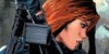
Anyway, this art is of Tasha and Hawks in the Battle scene. It represent there partnership even though they have love for each other. ( and I tossed in a stock pic of Tony in his suit for you Iron Man fans. I being one of them. That, and I stink at drawing his suit! lol)
Enjoy! I'll probably be doing a ton of Avengers fanart during the Christmas break because I will have nothing else to do! lol
Iron Man (Tony Stark) Stock picture here: [link]
Clint Barton (Hawkeye)/Natasha Romanoff (Black Widow)/Tony Stark (Iron Man) (C) Marvel Comics™/The Avengers(2012)
Art (C) *jennawolf48™
A little bit of Clint x Natasha in here. I. LOVE. THAT. COUPLE. There awesome!
Anyway, this art is of Tasha and Hawks in the Battle scene. It represent there partnership even though they have love for each other. ( and I tossed in a stock pic of Tony in his suit for you Iron Man fans. I being one of them. That, and I stink at drawing his suit! lol)
Enjoy! I'll probably be doing a ton of Avengers fanart during the Christmas break because I will have nothing else to do! lol
Iron Man (Tony Stark) Stock picture here: [link]
Clint Barton (Hawkeye)/Natasha Romanoff (Black Widow)/Tony Stark (Iron Man) (C) Marvel Comics™/The Avengers(2012)
Art (C) *jennawolf48™
Image size
3000x2000px 5.32 MB
Comments42
Join the community to add your comment. Already a deviant? Log In
You've composed this exceedingly well. It's very tense, very high-action, while offering a close view of our lovely assassins. However, that said, it seems apparent from a closer look that you're better at the ideas and the broad strokes, gorgeous as they are, than the specifics of human anatomy.
Both persons' hair is wonderfully done, and Tasha's face is picture-perfect. Her shoulders are however too high and awkwardly placed, and the leg she has raised is doing a rather poor job of being foreshortened and placed correctly (is that a twisted ankle at the bottom of that leg? Was that intentional as a throwback to the helicarrier saga?). Her stance in general is awkward (and anatomically incorrect/painful) and not as dynamic as the scene would demand. I'd suggest angling her body to match her head, so that her raised knee is more easily depicted and she can get both arms in the fight.
Clint's face is a tad less a spot-on rendition of Renner's, but but his raised arm is a bit awkward, both in the way his hand is drawn and in the angles that compose the elbow. Other than that, though, he's pretty well-drawn apart from some minor musculature things with the arms (because Renner has impossible biceps, haha). I like the attention to detail with the nails on his bow hand, though.
Props - you got both their outfits pretty much perfect, as you probably know. Seams on Tasha's catsuit could be rendered in thinner, sharper lines or not at all; her bracers are doing a poor job of appearing as a cylindrical whole. Barton's arm-brace-thing is digging into his flesh a little, but I guess that's what would actually happen. In general, I think you've got a real eye for detail that's being let down by a lack of cleaning up those details in your own work, like polishing off the smooth lines in the bow which seem a little hesitant in places. Ditto the insignia on Tasha's belt, etc.
Background- as I said, beautiful. The colors are picturesque and indicative; you're very good at this indicate-don't-depict thing, which unfortunately doesn't work out so well for your foreground characters. I love the little touch of Stark hovering in the background, repulsor ray and all, and the way you've got light playing off the whole thing is far, far beyond anything I've achieved or probably will any time soon. Stark Tower, too, is immediately recognizable. I just have the one quibble (which was probably forced by composition, actually) that the skyscraper that's dwarfing Stark Tower is impossible in practice given the concept of ST being the largest thing on the skyline, unless there's some serious perspective-fudging going on.
In short: beautiful, just short of poster-worthy because of lack of attention to fine detail. Closer reference to models or photographs in composing human positions would have helped, as would more time spent on the work - but I imagine that this wasn't meant to be an epic labour of love that would end up framed on a wall anyway. If you did decide to go that route, there's not that much that needs to be changed about the concept for it to work; you'd just need a few more dedicated hours to improve on the execution.